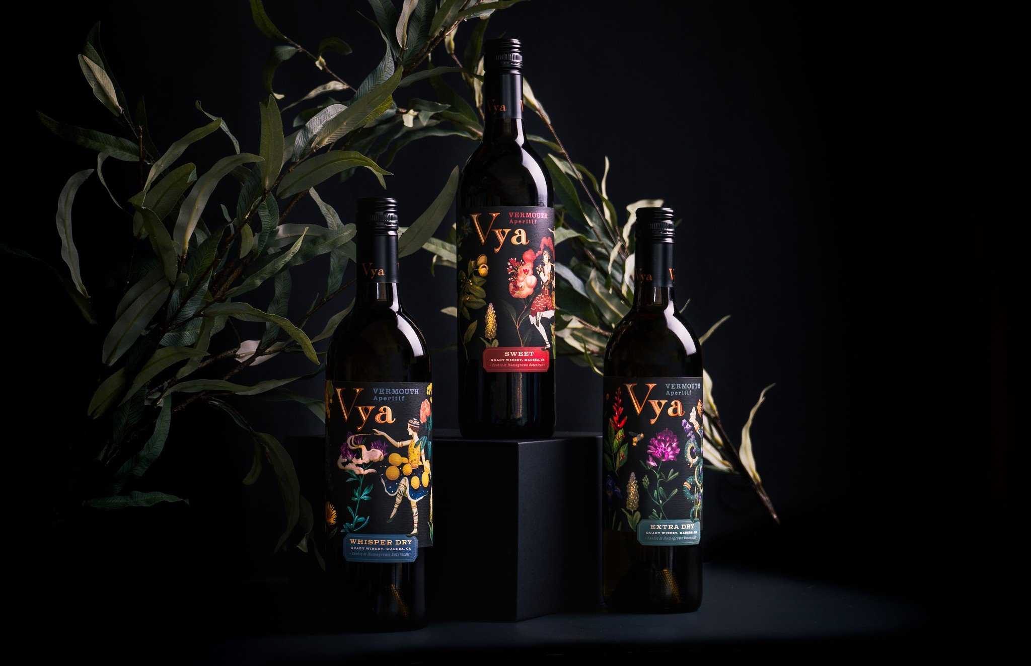
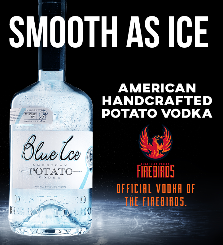
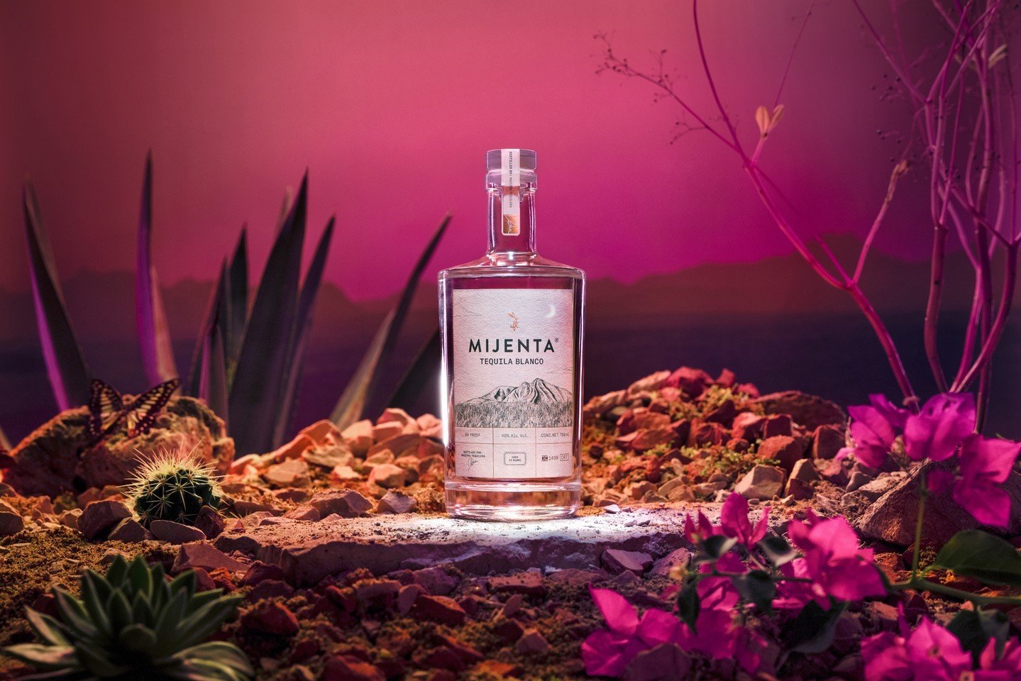
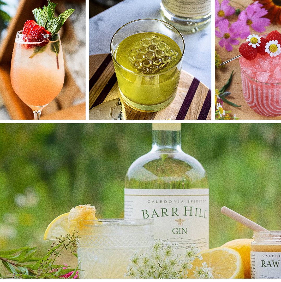
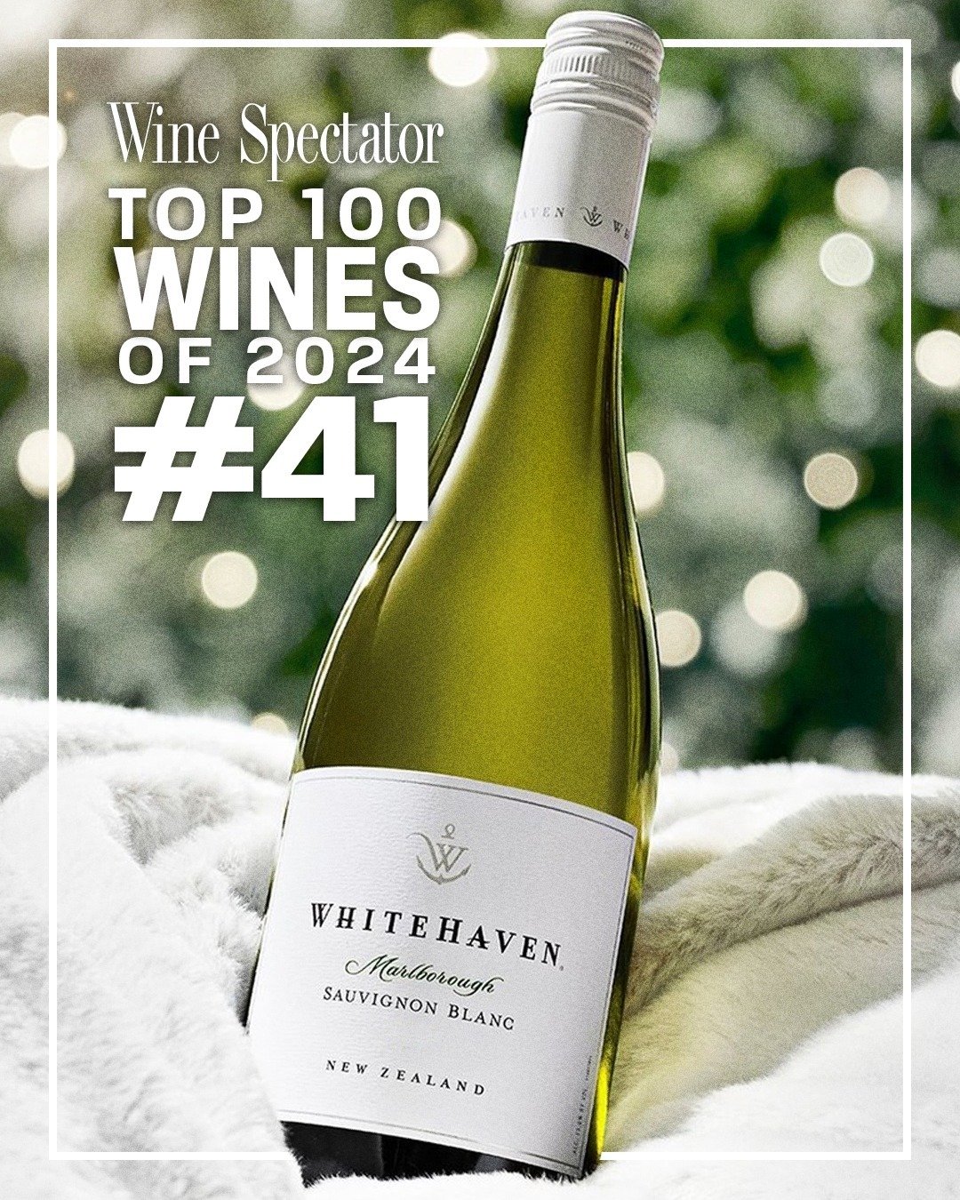
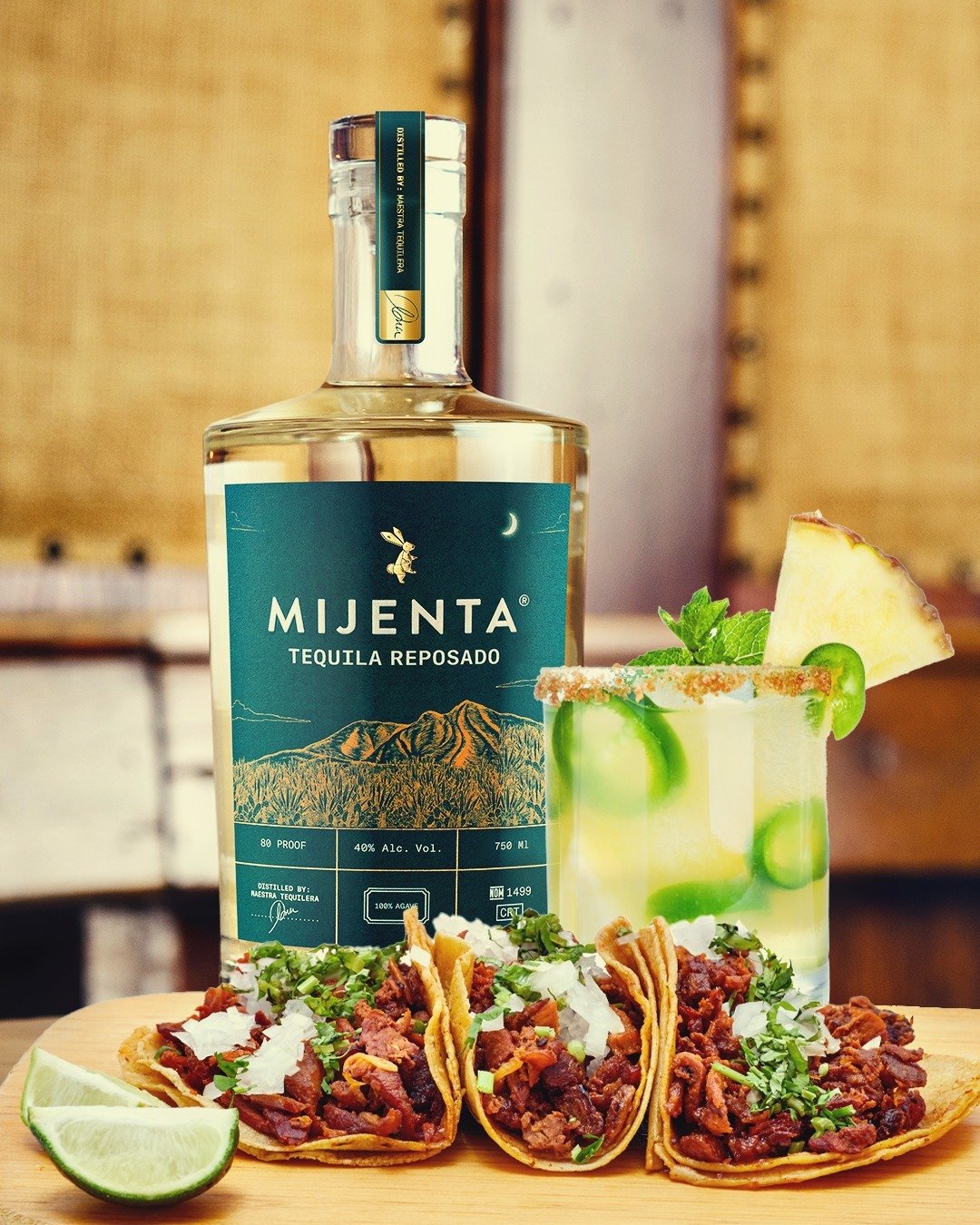
Doing a yearly product catalog is no easy feat especially during the last 4 months of the year. THE peak time period in the alcohol beverage industry. Producing a catalog with 90% of our portfolio was really daunting. Whether it was taking our own product shots, doing market research for the brands, or creating custom icons and graphics everything was done out of a labor of love (and insanity). However when I see the end result and run my fingers over the beautiful covers and go through the pages I dictated the look and feel for, I am so proud and grateful.
Here are a selection of past catalogs that I have been in the Art Director role for. Each year I came up with a theme and a branding design style guide for the designers to follow to finish the project. I had final approval of all the designs and worked closely with the VP of Marketing to get it perfect. These catalogs are very well received and is a proven sales tool for the Holiday time period that yield results in sales.
We decided to release a dual issue of Wine & Beer then Spirits as a stand alone. This was very icon design heavy with all of the digestible bites of selling points on some of the key Suppliers within the catalog. The covers are printed on this very special paper stock that is beautiful to see in person, and we used a rose gold foil on both books of all the icons used within the book.
For the 2015 Edition of the Wine Warehouse Catalog it was a collaborative effort of making this feel like a travel logue of a person's vast journey across WW portfolio of wine, beer, and spirits. We did the cover in the very similar style of a US Passport down to the Gold foil, rounded corners, matte inside paper and that blue leather feel of the actual passport. It was a labor of love between the Graphics Dept in 2015.
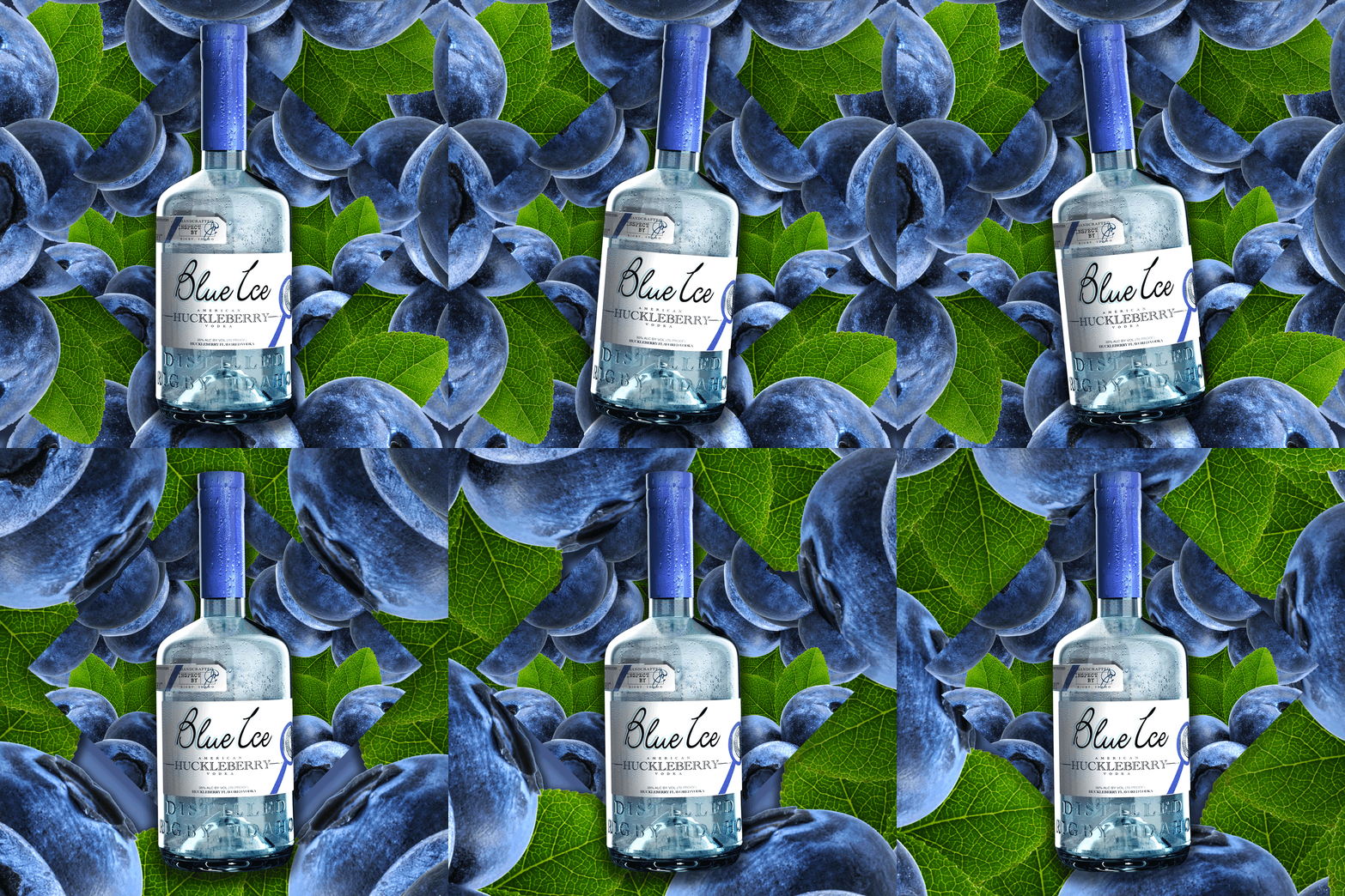
This is the 2nd Edition of the Annual Spirit Catalog. The theme was still to do custom environments for the bottles to live in. We built the backgrounds from the ground up and this was a very design heavy edition. Yet was still really fun and we were able to really let some of our imaginations come loose and create some far out stuff.
For the 2014 Holiday Catalog theme, it was a mix of Great Gatsby, Art Deco-ish with modern influenced elements and feel. Very clean lines, and we focused heavily on creating elements that jumped off the page and complimented the product shots. This book relied heavily on the graphics to make the products shine and give it a luxurious high end feel.
A small overview of the projects I have done in my time at Wine Warehouse. From creating custom ads to layout page designs that support a certain selling time frame; I've been able to create a lot of pieces in within the Alcohol Beverage Industry.
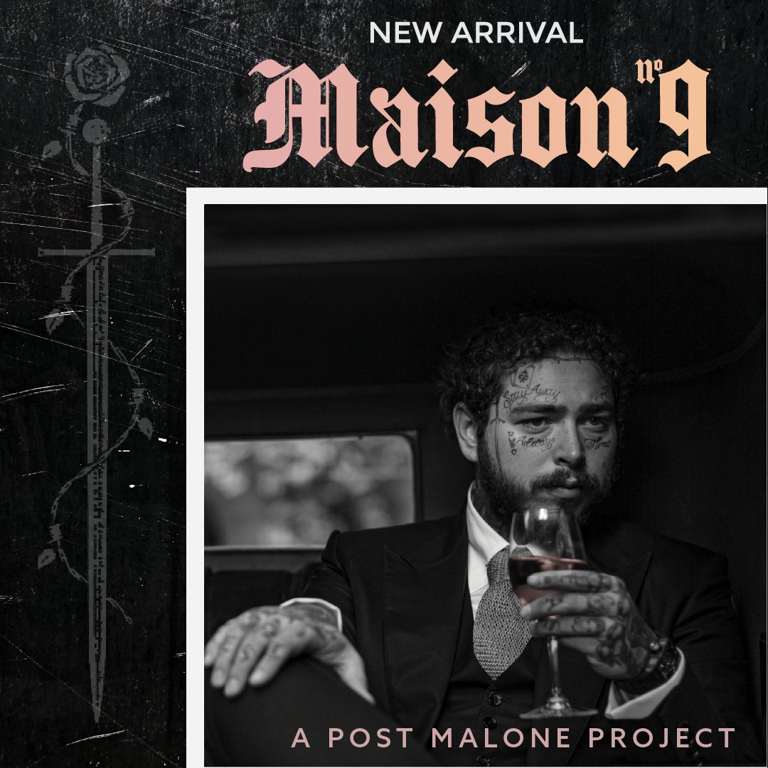
Dave Phinney is a big deal in the Wine industry, so when a special limited release of his highly anticipated return to Zinfandel blends was going to be released, a sneak preview of the wines and their unique label artwork had to be hyped up. This was a postcard intended to give buyers a sneak preview of the wines and very personal letter from the winemaker Dave Phinney about the specialness of this release. I wanted to create something very edgy, and dark to be in line with their branding and allude to the fact that this is very special release from Orin Swift. All of the labels were hand done and had a great tactile feel when you have the wines. I love doing POS for brands that are very different than what’s in the market currently.
Planning the WW yearly trade tastings has given me the skills and ability to see a plan from beginning all the way till the day of the event. Whether it was planning the theme or focus tables at each event, the food menu, to coordinating the vendors and products being delivered to the venue it was all a labor of love. I led a small logistics team on the day of and was the point of contact for each trade show.
This is a progression of the years coordinating the events and the Tasting Invite design I did yearly for them. The main ask every year is to to make sure all 3 aspects of the WW Brand Portfolio of wine, beer, and spirits have equal shine. It was my yearly design challenge to be able to come up with a fresh design and make it current.
I created a mosaic tile piece to represent that each of facet of the company (wine, beer, and spirits) when put together create a whole picture. I also stayed with the company colors of Burgundy and Gray to accent the visual.
For the 2017 invites, I wanted to match the new WW website and its colors. Thus making it all black and very classy. I was going for something very minimalistic and simple but to still showcase that WW is a Wine, Beer, and Spirit distributor. I've always wanted to do a design using the negative shape and I'm glad I was able to use it for this design.
I definitely wanted to play up the Spring time season on this year's invite and give it a more feminine and soft touch. I still tried to use the WW burgundy as the anchoring point of the color palette and used clean typefaces to not compete with the floral background. I also wanted to reinforce the WW in the background of the floral cutouts.
I created a collage like piece of trade silhouettes while promoting the 4 locations for the 2015 year. Overlaid this on an abstract wine glass picture with some transprecancy layers.
I used 3 circles of liquid to symbolize Wine, Beer, and Spirits in the same WW branding color scheme on a clean background. Type was the main focus of this invite. Very modern with clean lines.
I played up the WW burgundy with shades of oranges, and red to give it a vibrant color palette. I also used different trade silhouettes overlapped each other to create depth and interesting shapes.
I wanted to use shades of their burgundy specific color to make an almost deconstructed wine glass. Very minimalistic and clean lines.
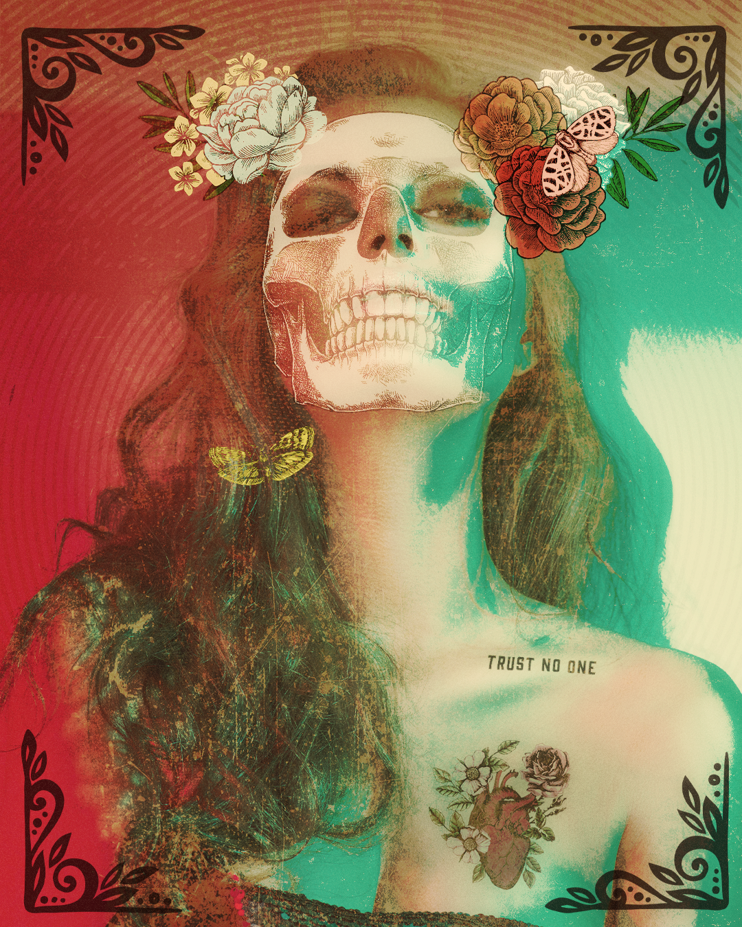
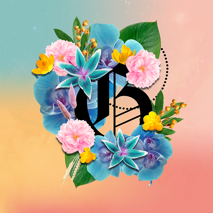
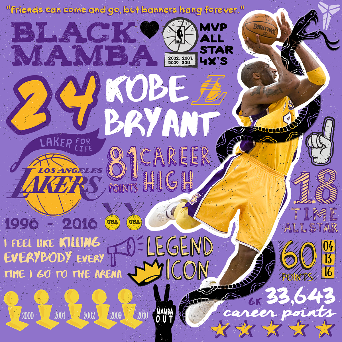
Projects that I chose to create for my myself and for no other reason than I am passionate about art and the subjects within them.
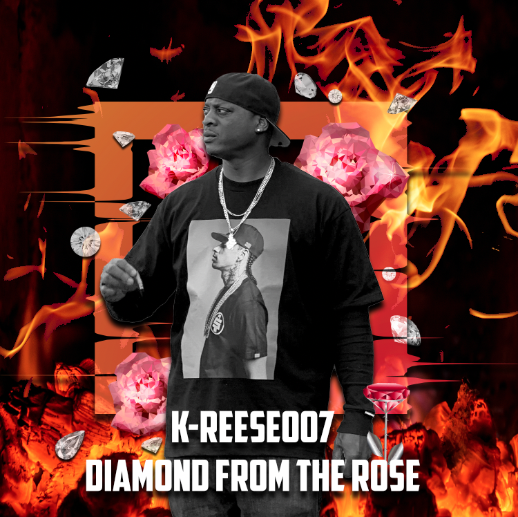
Song Cover for Hip Hop Rap Artist Kreese-007
Blessed and thankful to have friends who approach me with their passion projects, side hustles, events or whatever their needs may be to get their ideas out and visualize their thoughts. These projects have also made me a more well rounded designer tackling various styles and mediums.
I made this for a friend who had a side hustle of baking these delicious and moist cookies. She wanted to pay me in only cookies but I thought I would be taking advantage of her with that type of payment. ;) She wanted a simple design that was able to translate well into a stamp or an easy sticker on the packaging of bags or boxes.
I was randomly contacted about my previous logo that I had done for my friend’s wedding back in 2011 to be used for an up and coming small makeup brand called “KayK Cosmetics”. I only refined the logo to be smoother and clean edges for this makeup brand and licensed this logo to them. Exciting to see some of my work up on makeup items.
I updated the Certifix Live Scan website for their header images to give it a more relaxed and cohesive feel. I also created graphic icons for their important points on the website to go on each specific landing page.
A couple designs I did for a local Whittier business that was going to have a booth at an Autism Awareness walk.
They wanted to keep with the blue theme but stay away from the puzzle theme, and promote the slogan, "Shine A Light On Autism" in different kid friendly graphics and elements.
I had a lot of fun with this project since it was geared to be bright, friendly, and simple. I did a typographic representation of the slogan in the first design and kept with a hand drawn feel. The 2nd design is kind of my spin on street art with a small graffiti artist Banksy feel. The 3rd design I made it a caricature boy and had fun drawing my own little character with a simple flashlight element of pointing up.
A friend of mine approached me about doing some branding for his side business of providing a Mobile Cigar Bar experience to expecting Grooms. A grown man's pleasure and experience. He wanted the logo to reflect a regal and refined quality of year's past; but still remained professional and open.
I wanted to use a strong masculine typeface that would be bold and have a vintage feel. He also wanted to incorporate his tagline into the logo to solidify the unique idea of bringing a Cigar Bar to you. I tried to capture the era of good cigars enhanced with strong whiskey, and fellowship with the rounded leaf elements that surrounded the logo; reminiscent of old Whiskey Labels.
Head Up Fades was a local Long Beach barbershop that was owned by a street savvy, silver tongued friend of mine. The phrase, "Head Up Fades" can mean to go straight up with someone you're fighting with. Man on Man. No others needed or wanted. A philosophy he strongly believes. Which coincidently also means a fresh cut out of the barber chair; something else he strongly believed in and was good at doing.
I wanted the logo to be strong and dynamic of two boxing silhouettes. Freezing that moment right before impact. Used also a grunge font treatment and additional barbershop silhouettes at the bottom to complete the logo. Kept it minimal, sporty, and dynamic.
Also kept it in the classic LB colors of Black & Yellow with hints of grey since the shop was well known around the community and the owner was proud to be a small Long Beach business.
One of my best friends got married and asked me to design her Spanish Rustic theme Wedding which included Save the Dates, Wedding Day Signage (custom Spanish postcard table names, directional signage, and custom cigar bar signage). Had a lot of fun with this and it was such a beautiful wedding that when I see this in present day I am able to remember the feelings of that day through the designs I created.